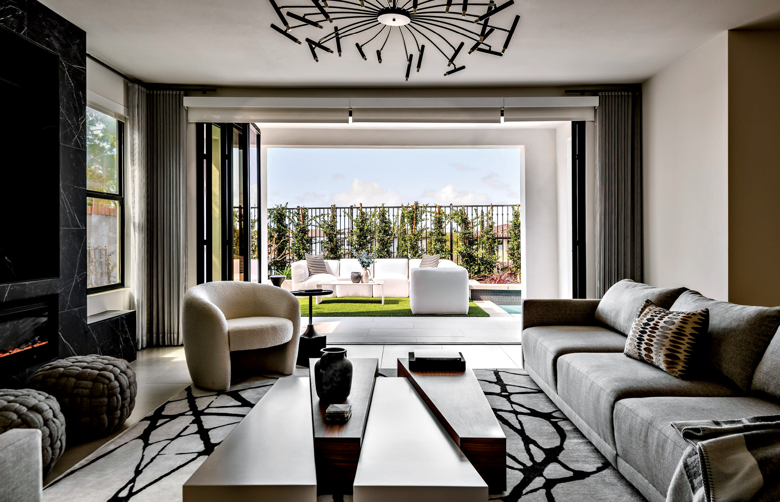
The ability to see things not as they are but as they could be is perhaps an interior designer’s greatest skill. Even when—perhaps especially when—faced with a home that has a bit of a mixed personality. Such was the situation designer Anita Jacobi found herself in when she and her husband sold the abode where they’d raised their daughters for two decades. Many months rolled by before the couple pressed go on a San Juan Capistrano Mediterranean Revival-style property as their next home... but it didn’t check all their boxes. Sure, the oceanside neighborhood and the street itself were dreamy, but the yard felt cramped and the layout needed updates. The interior’s inconsistent finishes especially begged for an intervention. “The house had all sorts of flavor, with every single kind of style tucked into it: French country, Asian, Spanish—there were 11 different types of tile, with wood and carpet too,” Jacobi shares. “I kept thinking, ‘What am I doing?’”
Home Details
Interior Design
Anita Jacobi, Orange Coast Interior Design
Home Builder
Ric Serna, RS Construction & Development Inc.
What she did, of course, was lean into that proficiency at seeing past the problems to find solutions. In this case, it took some undoing to get there. Working with general contractor and longtime collaborator Ric Serna, Jacobi stripped away every bit of ornamentation and all the warring design styles, plus removed several load-bearing walls. In their place, 18 new beams now open up the layout and visually connect the main level’s public spaces, all of which are sectioned into one large great room. “I started over with a rectangle,” the designer shares, “and warmed up to the house once I started designing.”
Seeing it as a blank canvas kickstarted Jacobi’s imagination for a new aesthetic direction. She decided to put her own spin on what she describes as a midcentury modern-inspired style: minimalistic, with clean lines and pronounced angles paired with a tightly edited, high-contrast color palette. A pronounced use of black reads as both bold and moody, while earthy materials, from warm woods to natural stone, balance and ground the design. The look is a marked departure from Jacobi’s former family residence, which leaned bright and white. Her new home’s reimagined design also exudes a distinctly different atmosphere from the soft shades and relaxed vibe so typical of coastal properties.

Dunn-Edwards’ Brooding Storm and a panel of vertical slats create a chic ambience in the primary suite. Jacobi customized the chaise and bed, which is topped with Kravet fabric pillows. The bench is Four Hands and the rug is Safavieh.
“This is a grown-up house that matches where we are in life,” the designer explains. “It’s more sophisticated, more adult, more us now—even our kids’ rooms are ‘adult’ kids’ rooms.” She set the tone at the entry, where deep gray walls set off vertical wooden slats. Minimalistic and modern, similar slats designs repeat throughout the house, adding texture and warmth to a hallway’s built-ins, the primary suite and the outdoor terrace. Playing with visual elements like these, which Jacobi had experimented with in her vacation getaway and several client homes, pushed her to treat her new residence more like a client’s project. “I pour my heart into every space I create, and the emotional investment is even greater when its personal,” she muses. “With clients you think beautiful and functional—taking my feelings out helped me to really start seeing this home and being excited about it.”
Jacobi gave herself permission to make impactful choices. For instance, moving a powder room and combining its square footage with a mud room, closet, pantry and the existing galleylike narrow kitchen allowed for an expansive open-concept room to cook and serve—and more than doubled the kitchen’s size. The couple now entertain and gather around two islands and enjoy ocean views from a larger window.
Upstairs, Jacobi put a considerable stamp on the primary suite, reconfiguring the bathroom to carve out his-and-hers amenities (including walk-in glass showers and a double vanity) and placing a striking bathtub surround of blackand-white porcelain tile as the room’s undisputed showpiece. “I had this vision of a dark moody bathroom, kind of sexy—and I knew it was going to be dramatic,” she says. The designer also repurposed one of the home’s six bedrooms into a dressing room and dream closet.
Certain spaces called for creative solutions. The limited backyard area, for instance, was plotted “by the inch,” Jacobi notes, to allow for a pool and outdoor lounge, with a BBQ area tucked into the side yard. In other spaces, the arrangements just clicked. Take the living room’s geometric coffee table, a piece the designer had fallen for but never managed to fit into the home of a client, until she became her own. Happily, all her initial hesitancy has since given way to a different conclusion: “Now I can’t wait to come home,” she says.

Bridging the living and dining areas of the great room, a Sunpan counter-height table provides a landing spot for cocktails, ringed by Four Hands charcoal bouclé stools. Works by Dan Hobday and Jess Engle hang from chains as a backdrop.


